WWE
WWE PACKAGING, BRAND DESIGN AND STYLE GUIDE
MATTEL
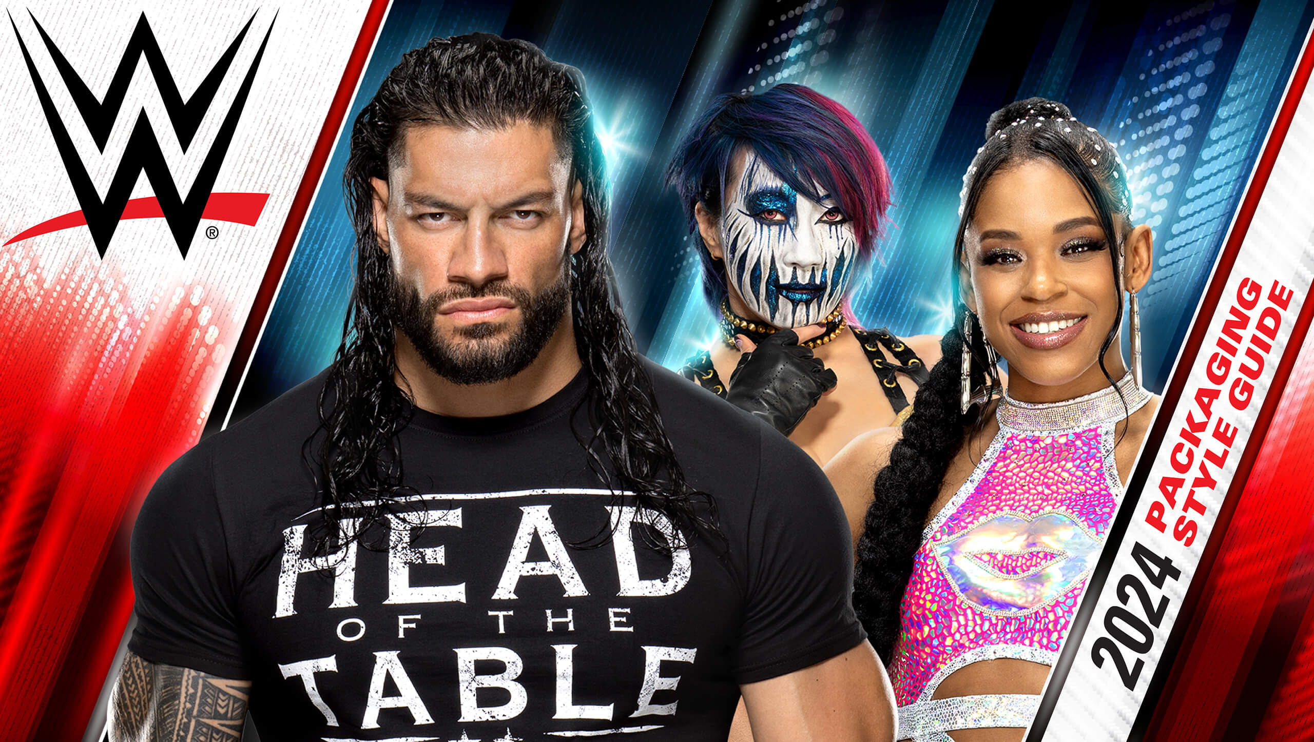
OOOH YEAH! NEW WWE BRANDING STYLE GUIDE FLYING IN FROM THE TOP ROPE!
When Mattel tagged us in to develop new Branding and Package Design and a Style Guide for WWE’s 2024 core line, we knew we had to bring the no-holds-barred thunder. Our challenge? To deliver the raw energy of WWE right into the hands of both young enthusiasts and seasoned collectors.
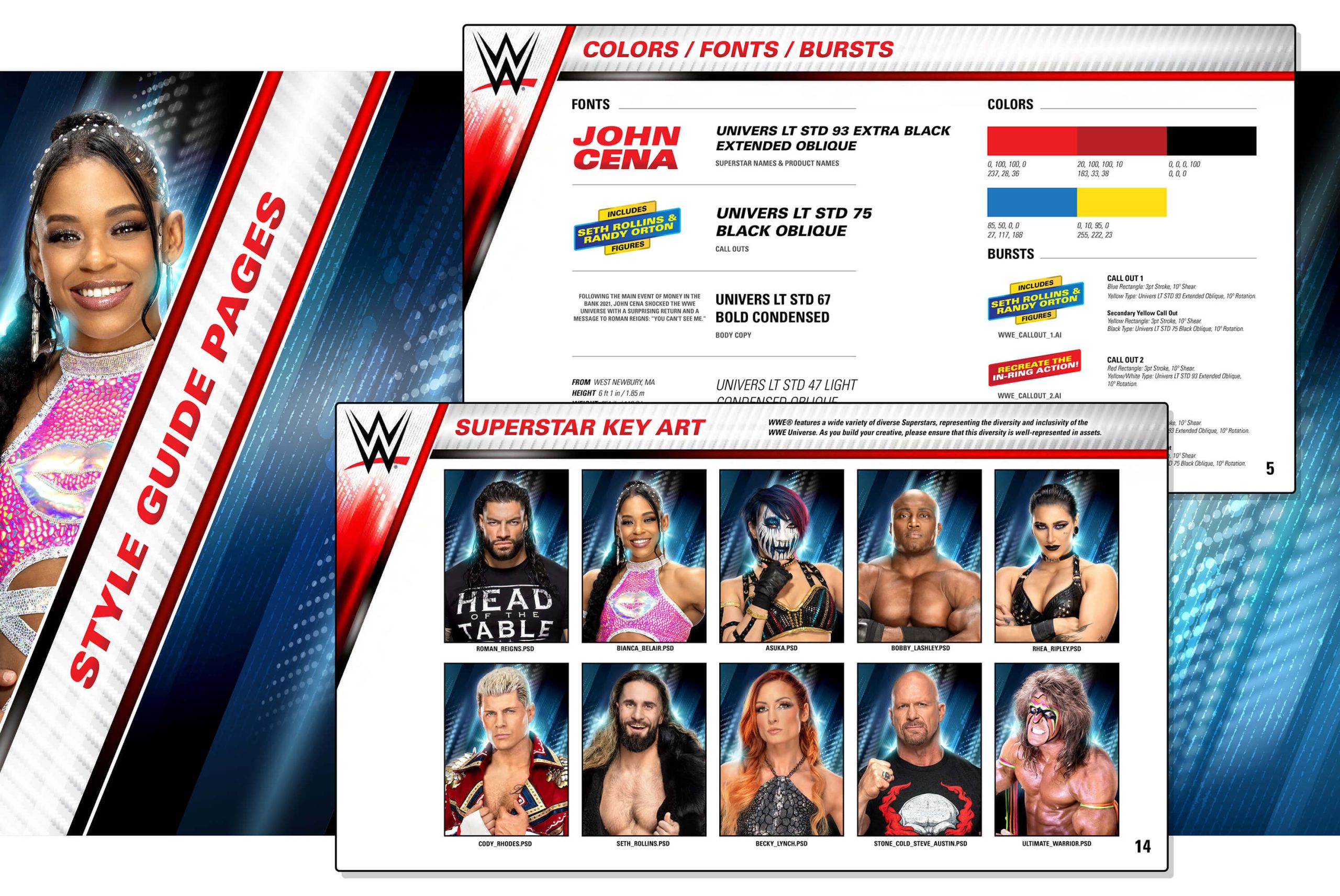
Picture this: spotlights blazing, adrenaline pumping, and the crowd roaring. With the WWE Packaging Style Guide, we crafted an experience—a powerbomb of visual storytelling. In the WWE, Superstars reign supreme, so we made sure their faces and names take center stage and every Superstar leaps off the shelves with jaw-dropping visuals.
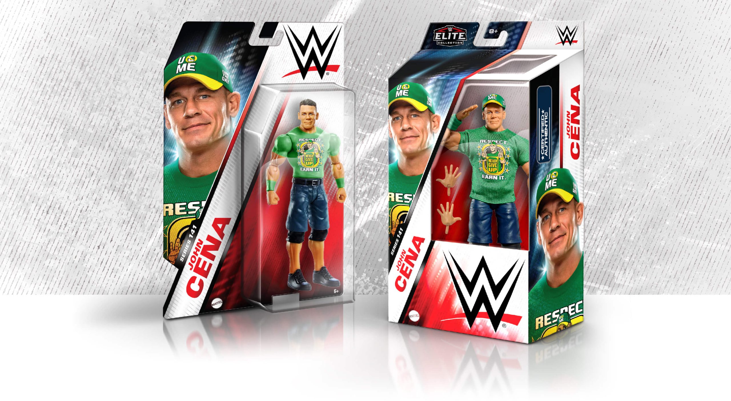

EXPANDING THE BRAND
GETTING PUMPED FOR THE SPOTLIGHT!
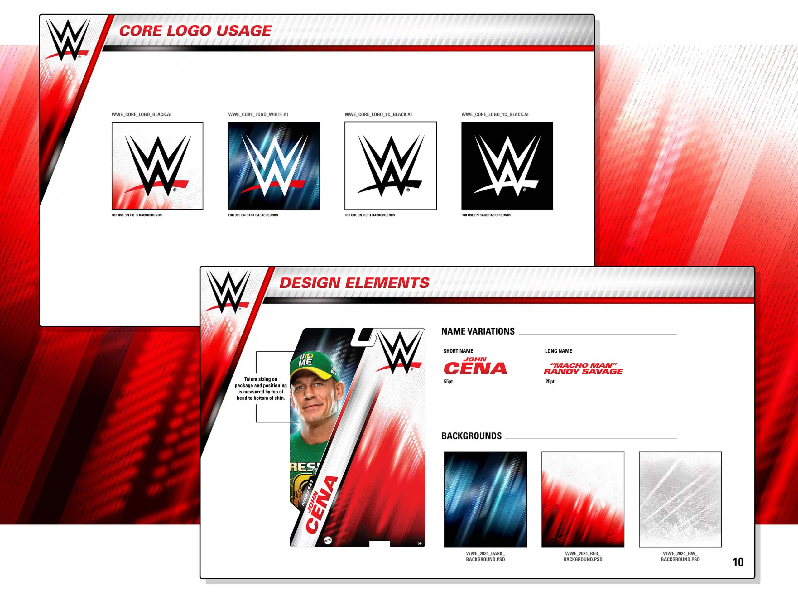
Our powerhouse team established a brand identity that’s as versatile as a WWE superstar, ensuring it would dominate across a diverse range of packaging. From the canvas of brand colors and fonts to the electrifying design elements, we left no turnbuckle unturned. And with the signature WWE Superstar key art leading the charge, Mattel’s products are ready to enter the ring of consumer consciousness and emerge victorious every time!